In many cases, packaging boxes are the outer packaging of products and are highly valued by people. Therefore, it requires beauty and generosity to meet people's aesthetic standards, which depends on the planning and distribution of colors, attachment to graphics, and the connotation of text. The important thing is the color of the packaging box. Color is the general trend and emotion of color allocation on the screen. It is the dominant color in a set of colors, dominating printing technology throughout the entire image. Packaging requires product information to be visually highlighted on long-distance shelves, which requires a strong sense of unity to collaborate with printing malls.
Therefore, the key to packaging color planning is color planning. The requirements for color planning are common to the main functions of the product, the requirements for color planning are common to the times, and the preferences and dislikes of colors among different regions and ethnic groups are also common. In order to adapt to this change, packaging boxes should keep up with the trend of the times.
More importantly, it is the mutual contrast and contrast of colors. These two opposite colors are called contrasting colors. Their color tones and brightness are very different, leaving a sharp contrast. Only through comparison can colors accurately express image printing.
If there is comparison, there is harmony. These two adjacent colors are called harmonious color prints. Colors give people a feeling of softness, richness, elegance, pleasure, and comfort.
Another important aspect of color is rhythm. People often say that music has rhythm. Why do colors also have a rhythm? Rhythm is an important element of visual style. The screen reflects many changes, such as intensity, brightness, softness, realism, etc. The alternation of these two sides of the spear and shield is not a simple repetition, but a rhythmic movement carried out in various ways. It has both repeatability and scalability, and packaging box manufacturers mutually constrain and promote each other in various aspects, reflecting the natural and harmonious printing.
The basic requirement of packaging color planning is to handle the relationship between change and commonality, seek change in commonality, and seek commonality in change, which is called color rhythm.
The color planning of the gift box packaging is very exquisite. This is not a simple association, it can immediately come up with good ideas. After careful consideration and mastery of colors, it is not an overnight task to plan packaging perfectly.
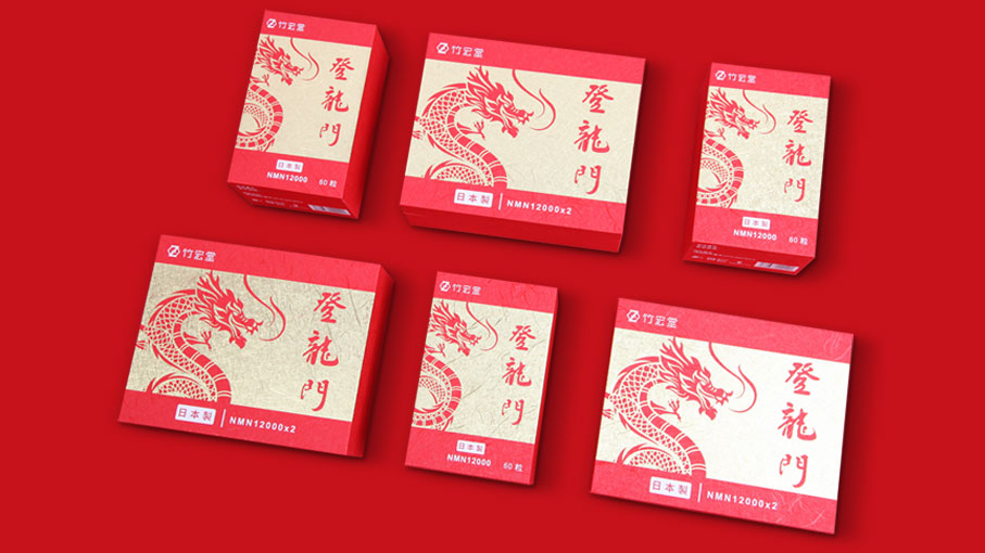
The most important thing in packaging is its color. The role of color in packaging planning is determined by reflected light, the color elements distributed around us, and even the perspective of the audience: each color has a different effect, which can affect our perception. Next, the staff of Jinyang Huayu Paper Products will work with us to understand the mutual distribution of six colors in packaging planning:
1. Red: Red has a warm color, strong personality, and extroversion, and is also a very stimulating color. Red attracts people's attention, making them excited, serious, and excited, as well as causing visual fatigue.
2. Yellow: cold, arrogant, sensitive, yellow, with an expanded visual image. Among various colors, yellow is a delicate color.
3. Blue: A cool and introverted color that often provides a profound, broad-spectrum, and peaceful space for colors with distinct personalities and strong expansion. It becomes a friendly and humble friend, highlighting bright colors. Blue is also a color that appears to maintain a strong personality after being diluted.
4. Green: Mix yellow and blue to form green. In green, the expansion of yellow and the shortening of blue are moderate. This gift box counteracts the warmth of yellow and the coldness of blue. In this way, the green personality is peaceful and stable. It is a soft, quiet, decorative, and beautiful color.
5. Purple: Among colored colors, purple has lower brightness. The low brightness of purple gives people a feeling of sadness and mystery.
6. White: White has a bright color sense. It is simple, pure, and joyful. White is pure and cannot be aggressive. If any other color is added to white, it will affect its purity and make its characteristics more subtle
The importance of color in packaging box planning is self-evident. It also plays an important role in packaging box planning. A good packaging box cannot do without a good color distribution, and color distribution is also a very important knowledge. Different colors have different feelings for people. Please pay attention to the color distribution when selecting packaging boxes.